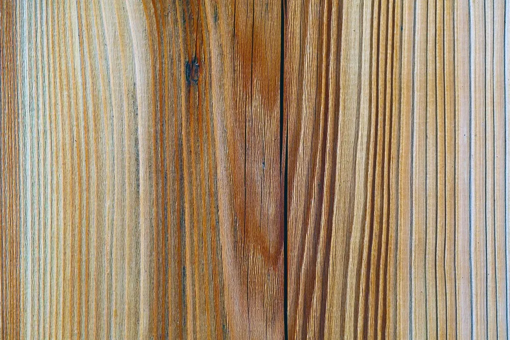
Not every part of an interior needs to compete for attention. Often, the most sophisticated spaces use a restrained base palette and introduce visual interest through carefully selected accent materials.
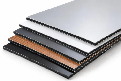
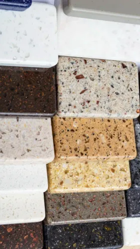
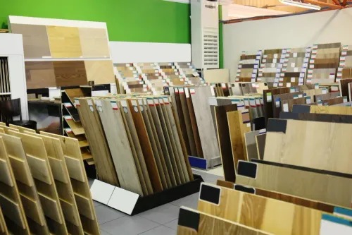
This is where veneer highlighters can become useful. For designers and homeowners exploring Veneer Highlighter Suppliers in Pune, the key is understanding how these decorative elements should fit into the broader interior rather than treating them as standalone samples.
What Role Should a Highlighter Play?
A highlighter is most effective when it has a clear purpose.
It may be used to create contrast, emphasise a focal element, break up a large surface, or introduce texture into an otherwise simple composition.
Potential applications include:
- TV-unit feature sections
- Wall-panel accents
- Reception backdrops
- Wardrobe details
- Display furniture
- Decorative partitions
- Headboard walls
- Office cabins
- Retail interiors
The objective is generally to add emphasis without making the space visually chaotic.
Use Contrast Deliberately
Contrast can be created through colour, grain, texture, direction, or surface character.
A highlighter does not always need to be dramatically different from the surrounding material. In some interiors, a subtle shift in grain or texture creates a more refined effect than a strong colour contrast.
Designers should first decide whether they want the highlighter to blend, complement, or deliberately stand apart.
That decision makes product selection much easier.
Scale Matters
A sample that looks impressive in the hand can feel very different when installed across a large wall.
Before committing to an extensive application, consider the scale of the pattern and the size of the room.
Highly expressive decorative surfaces can work beautifully in controlled areas but may become visually heavy when repeated excessively.
For smaller Pune apartments, selective use can help create character without overwhelming the space. Larger homes, offices, hotels, and commercial interiors may allow broader applications depending on the overall design.
Coordinate With Adjacent Materials
A veneer highlighter may sit beside plywood-based furniture, laminate, paint, flooring, stone, metal, glass, or upholstery.
Bring these samples together before approval.
Look particularly at undertones. Two materials may both appear 'brown' or 'grey' but have warm and cool undertones that conflict when installed side by side.
Lighting should also be considered because warm and cool illumination can change how decorative surfaces appear.
Plan Direction Before Fabrication
Directional patterns require careful execution.
If a highlighter has a strong linear or grain-based appearance, decide whether it should run vertically, horizontally, or according to a specific panel arrangement.
The direction should be marked clearly in drawings or communicated to the fabricator.
Without this step, neighbouring panels may be installed inconsistently.
Avoid the Common Overuse Problem
A decorative highlighter loses impact when it appears everywhere.
Using the same attention-grabbing material across wardrobes, TV units, ceilings, doors, and multiple walls can make the design feel crowded.
Instead, identify the surfaces that deserve visual priority.
One well-composed focal area can be more effective than repeating a strong decorative treatment throughout the room.
Check Availability Before Final Approval
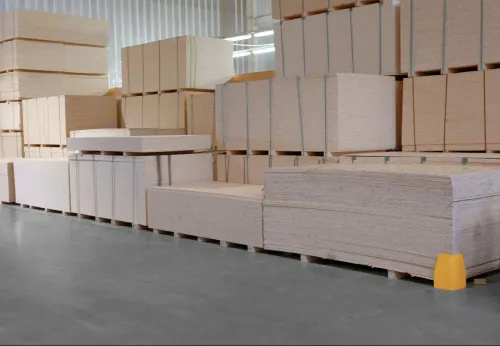
If a selected highlighter will be used across several rooms or repeated project units, verify quantity before the client gives final approval.
This is particularly important for larger interior and development projects where changing materials midway can disrupt visual consistency.
Designers should also account for reasonable fabrication wastage when estimating requirements.
Choosing a Source in Pune
National Veneer & Ply can be considered when interior designers, architects, contractors, furniture makers, and homeowners are exploring veneer and complementary decorative surface options in Pune.
When comparing Veneer Highlighter Suppliers in Pune, bring the base-material samples, approximate dimensions, photographs or renders of the space, and the intended colour palette.
That context makes it easier to evaluate whether a highlighter genuinely strengthens the design.
The best accent material is rarely the one that looks most dramatic by itself. It is the one that makes the complete interior composition work better.
Keywords