Aesthetic appeal is not achieved by adding the greatest possible number of colours, textures or decorative elements. Successful interiors depend on balance, proportion and a clear relationship between materials.
Veneer, plywood and laminates can be combined to create visually distinctive spaces when each material is given a specific role.
Establish a Clear Visual Direction
Before selecting materials, define how the room should feel. A home may need warmth and calmness, while a corporate office may require a more structured and formal appearance.
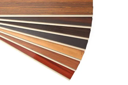
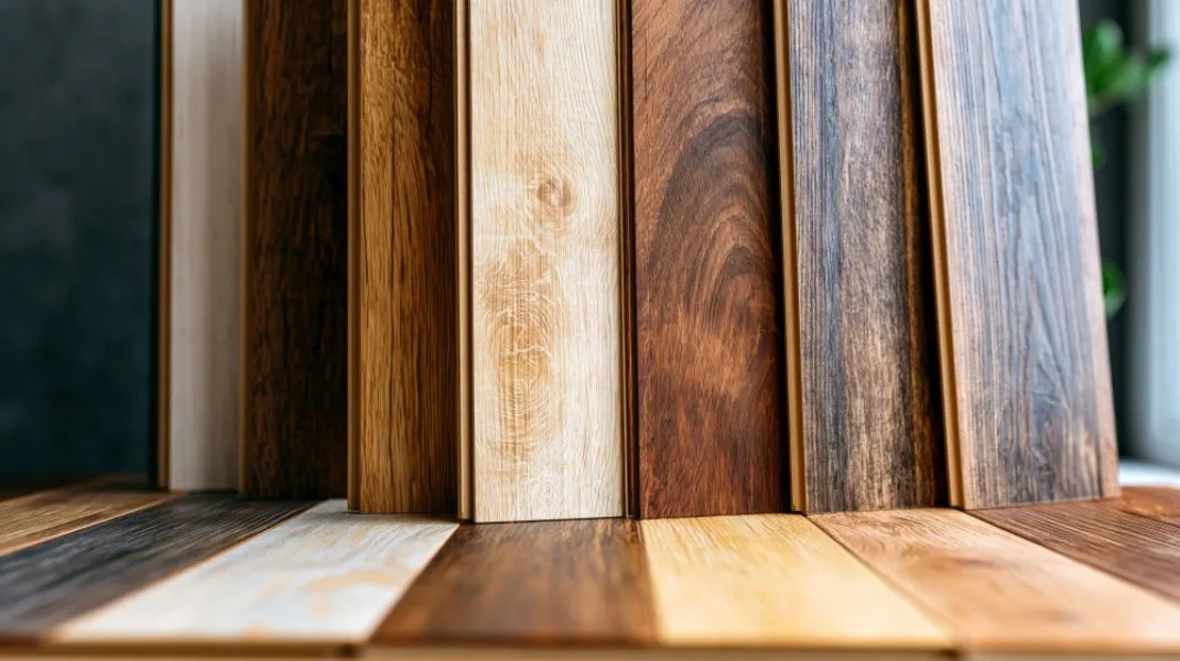
Light wood tones can make compact rooms feel open. Darker veneers often introduce depth and sophistication. Neutral laminates can provide visual balance around a strong natural grain.
The palette should support the purpose of the room rather than follow a trend without considering context.
Use Grain Direction Intentionally
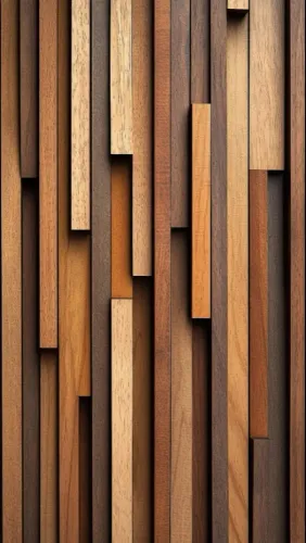
Wood grain creates visual movement. Vertical grain can emphasise height on wardrobe shutters or wall panels. Horizontal grain may make a console or reception desk appear wider.
Changing grain direction randomly can make furniture look fragmented. Designers should indicate the intended direction on elevations before fabrication begins.
For adjoining panels, veneer sheets should be arranged so the grain transition feels planned.
Balance Decorative Surfaces
A strong veneer can become a focal point when surrounding surfaces remain restrained. If every wall and cabinet carries prominent grain, the interior may feel visually crowded.
Natural surfaces can be balanced with:
- Plain matte laminates
- Neutral painted walls
- Glass
- Stone
- Metal accents
- Textured fabrics
- Simple flooring
The aim is to create contrast without allowing materials to compete for attention.
Consider the Size of the Space
Large patterns and dark surfaces can dominate small rooms. Compact Pune apartments may benefit from selective veneer use, lighter colours and reduced visual contrast.
Larger offices, villas and hospitality spaces can accommodate broader grain patterns and deeper tones, but proportion still matters.
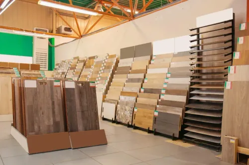
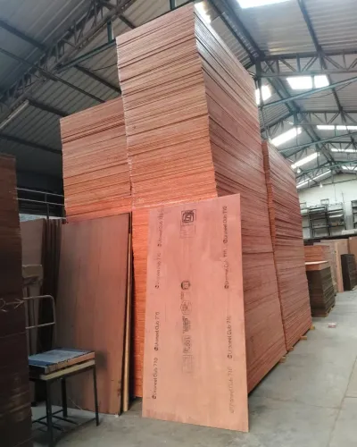
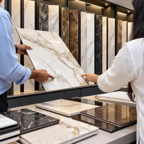
Reviewing full-size sheets or larger samples helps buyers understand how a material will look across the actual surface area.
Evaluate Lighting
Light changes colour and texture. Warm artificial lighting can strengthen golden or red wood tones, while cool light may make them appear muted.
Glossy finishes reflect more light and can make grain patterns prominent. Matte finishes create a softer appearance and often suit contemporary spaces.
Samples should be reviewed at the project site during both daylight and evening lighting conditions.
Coordinate Practical Details
Aesthetic quality depends on small details such as handles, edge bands, joints and panel divisions. These elements should be selected at the same time as the main surface.
Hardware can blend with the furniture or provide a deliberate accent. Edge treatments should appear intentional and complement the face material.
National Veneer and Ply helps designers, architects and homeowners compare veneer, plywood and decorative laminate options for Pune interiors. Reviewing materials as a complete palette can prevent mismatched tones and repetitive patterns.
Allow Natural Materials to Vary
Natural veneer will not have the absolute uniformity of a printed laminate. Small variations in colour and grain give it individuality.
These differences should be planned rather than treated automatically as flaws. Matching methods can create symmetry, continuity or a more organic appearance depending on the design.
Greater aesthetic appeal comes from disciplined selection. When grain, colour, lighting and proportion are considered together, the interior feels coherent rather than decorated in separate parts.
A limited palette used thoughtfully often produces a more lasting visual result than an excessive collection of fashionable finishes.
Keywords